KTP Recruitment
Reimagining the recruitment process of UMich’s premier technology organization.
Discipline
User Research, Product Design, Interaction Design, Product Thinking
Role
Principal UX Designer + Design Lead
Timeline
10 weeks (June - August 2022)
Tools
Design: Figma Research: TestFlight, Miro Development: Flutter, Dart, Android Studio, Firebase

SUMMARY
Kappa Theta Pi (KTP) is the world’s first professional technology fraternity. Founded at the University of Michigan, KTP offers members professional development, alumni connections, social growth, technological advancement, and academic support. From project teams and study groups to professional development workshops and hackathons/design jams, KTP celebrates a culture of growth where members are supported and encouraged to pursue opportunities related to their passions for tech.
The problem: With KTP’s exponential growth, recruitment for the organization has become a massive task as numbers have skyrocketed. KTP needs an organized, simplified way to manage prospective members as well as simplify the decision-making process for members.
TEAM
Software Development: Lucas Felpi, Golpari Abari, Zoe Banks, Frankie Delmolino, Serena Fan, Madison Jennings, Areeb Khan, Cindy Liu, Flynn Lyon, Kristine McLaughlin, Lily Medway, Raunak Mukherjee, Emma Rigg, Abbie Tooman
Design: Nathan Bennett, Flynn Lyon
CORE EXPERIENCES
1. VIEW EVERYONE INVOLVED IN THE RECRUITMENT PROCESS, FROM PROSPECTIVE MEMBERS TO EXECUTIVE BOARD
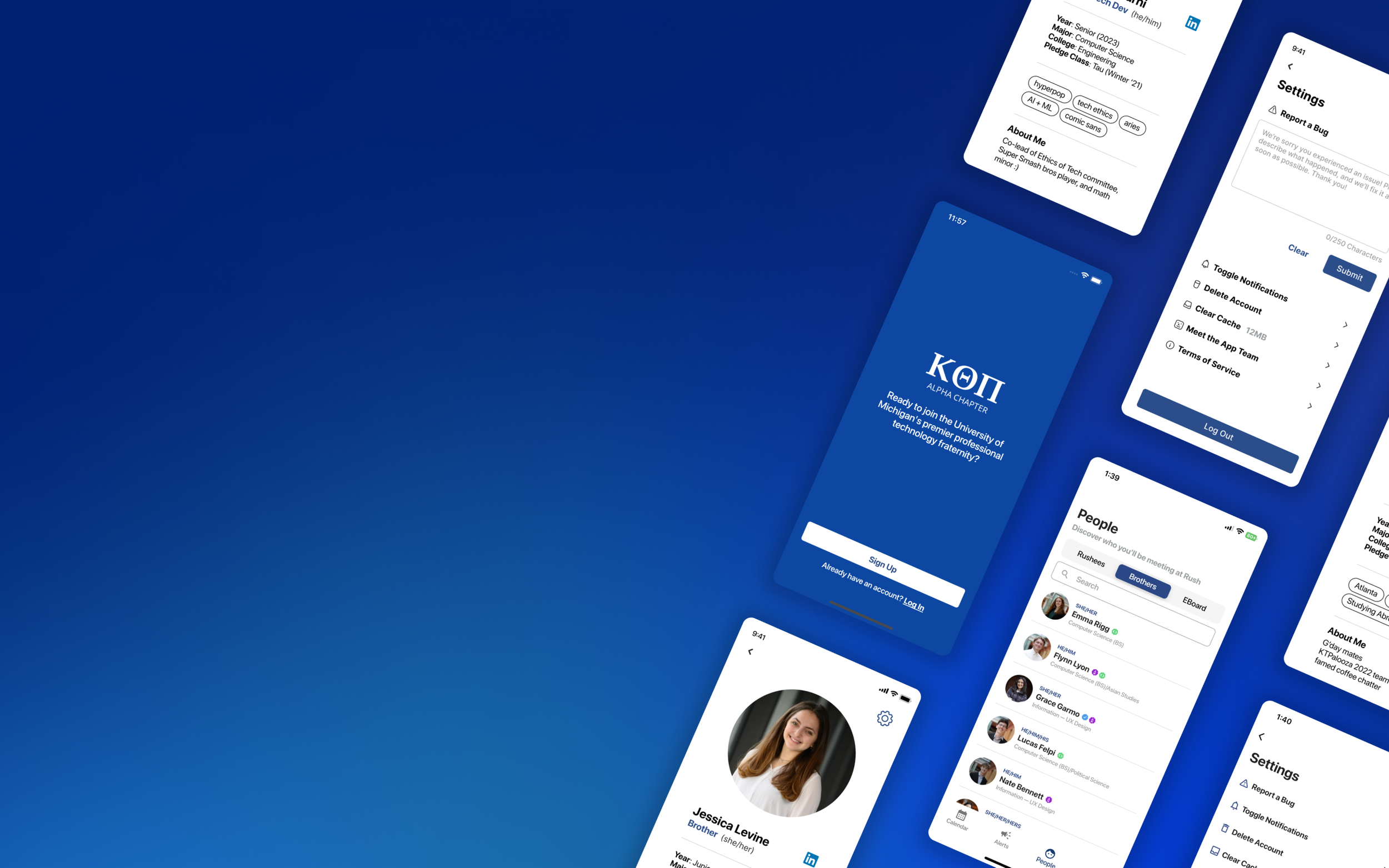
The people tab allows users to view prospective members (“Rushees”), current members (“Brothers”), and KTP’s executive board (“EBoard”). With the ability to customize profiles and self-provide information, the people tab works to make the recruitment process more transparent and give prospective members a sense of who they’ll be interacting with at events.
2. GET REMINDERS ABOUT UPCOMING EVENTS AND RSVP IN-APP
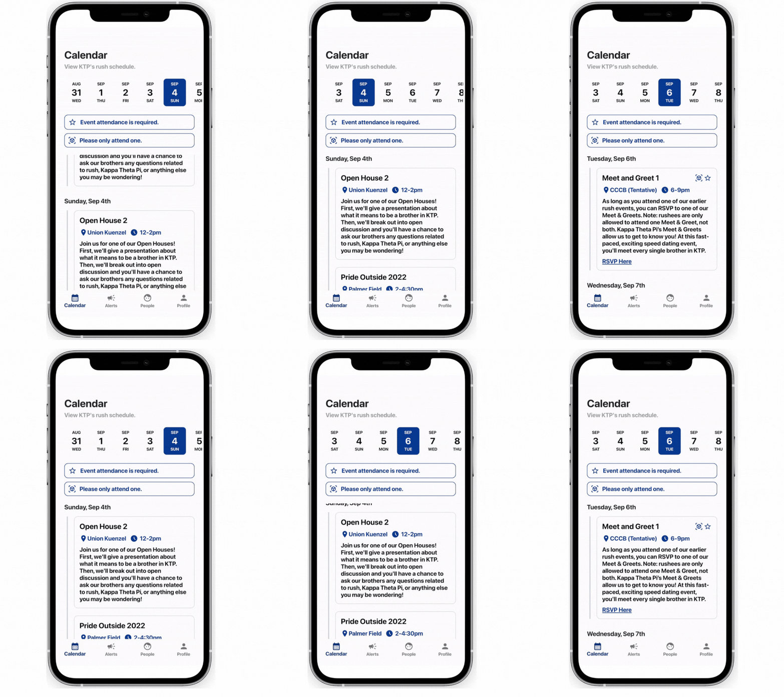
Users can get all the important information about events — such as location, time, description, and RSVP link — in one place. The reactive calendar allows for relevant events to be presented (as shown when the user clicks on different dates).
3. EASILY UNDERSTAND SCORES AND COMPARE ACROSS ALL PROSPECTIVE MEMBERS
Long gone are the days of looking at a jumble of numbers on a slideshow. With the scores feature, members can easily view all relevant information in one place and see how prospective members match up relative to other students. The scores feature makes the evaluation process effortless, fast, and comprehensive.
4. STREAMLINED ACCOUNT CREATION THAT MAKES SORTING DATA SIMPLE
Prior to the creation of the app, prospective members filled out their application materials via Google Form. Since the Google Form responses were open-text and case/spelling sensitive, sorting applicants by data such as graduation year, college, and major was extremely difficult. Now, with drop-down selections, inputs across all users are standardized and more suitable for data analysis.

HOLD ON….WHAT IN THE WORLD IS A TECH FRAT?
If you’re anything like me, you might think of traditional Greek life and tons of people living in huge houses. However, professional fraternities are organizations that promote academic, professional, and social growth within specific career fields. There’s professional frats for business, law, medicine, environmental sciences, and of course, technology! In fact, the nation’s first professional tech frat, Kappa Theta Pi (KTP), was established right here at the University of Michigan!
As a freshman at a huge university like UMich, the amount of clubs can be extremely overwhelming – each club has their own info session meetings at different times and dates, and just looking at them all on your calendar is enough to make you want to stay home and give up. However, as members of KTP, my team and I wanted to figure out a way to showcase our organization's values and benefits while making the recruitment process as simple as possible.
We asked ourselves, how do we make students want to join a tech frat?
Average week for a student during student org recruitment…so many obligations, so little time.
DISCOVERY
Although those of us on the team felt like there were aspects of the recruitment process that could be improved, we wanted to gain a greater understanding of how the rest of KTP’s members felt.
We recruited a variety of interview participants based on how long they’ve been in KTP as well as their involvement to understand if there were patterns within the feedback we received.
💡 KEY INSIGHT: FINDING RELEVANT INFORMATION ON STUDENTS IS DIFFICULT.
1. INFORMATION IS TOO SCATTERED, AND WE MAKE DECISIONS FAST.
A multitude of different application materials in combination with scores from recruitment events are required in order for us to make a confident and holistic decision. Students are evaluated on short-response essay questions, a fast-paced speed dating style event, a 1-minute introduction video, and coffee chats with 2-3 members, among other materials. Given the competitive nature of KTP, we must review and evaluate a large amount of applicants in the span of a few minutes — but that gets incredibly difficult when the information lives in different folders, files, and platforms.
By the time someone locates all the student info between their 12 open tabs, deliberating and voting is nearly over.
2. MEMBERS WANT TO BE FORMAL, YET APPROACHABLE.
As a professional student organization, we encourage our members to present themselves as such. However, we also strive to create relationships with interested students, and a sense of comfort and vulnerability is required. Especially as a younger student, it can be incredibly intimidating to approach an older member when you know so little about them. Because of this, members indicated that they care greatly about breaking that initial fear barrier.
3. MAKING DECISIONS FAIRLY IS MORE IMPORTANT TO MEMBERS THAN ANYTHING ELSE.
The most frequently reported concern among interviews was that above all, members want to carefully make decisions about who gets accepted into KTP. We try our best to combat implicit bias through training sessions, but members reported that most of their bias comes from hearing the opinions of other members. In our first round of recruitment, members interact with over 200 interested students and often forget any impressions or opinions.
IDEATION
CRAZY 8’S
I rounded up designers and developers and set an 8-minute timer. From these sketches, we began to hone in on specific goals and interactions.
MID-FIDELITY
After taking another look at our sketches from Crazy 8’s, we cross referenced common ideas with our goals and began to hone in on key experiences that were relevant to both members and students.
INFORMATION ARCHITECTURE
Because we had to design for two different experiences, it was especially crucial to have a visual representation of the app’s infrastructure and features.
🫂 OUR IDEATION SESSIONS REVEALED THAT WE NEEDED TO DESIGN TWO SEPARATE EXPERIENCES FOR THE APP
It was immediately clear from all the different ideas being brought up that some team members were under the impression that this app would be member-facing while others designed with the idea that this would be used by students going through the recruitment process. Both sides presented great ideas, and I thought, why not both?

WHAT I LEARNED
Our incredible design + dev team <3 (I’m on the right holding the sign!)
Creating and designing the KTP recruitment app was one of the most comprehensive, challenging, and rewarding projects I’ve ever embarked on.
I learned an extraordinary amount from working in an environment where I led a team and had to make big decisions, but also had to collaborate with my team and make sure that I was giving everyone the opportunity to share their thoughts.
This was also my first time creating a prototype that would become a real, downloadable product for people to use. Because of this, I faced challenges overcoming technical and time constraints, and I gained several insights on how to collaborate with developers.
This is the project I’m proudest of. It’s still hard to believe that a silly idea with friends became a tangible product with hundreds of users across campus.
Not to bore you with analytics, but here’s a statistic we’re pretty proud of :)


